

RLM Designs RetroFuture Logo
In the process of redoing this website, I wanted to rebrand it and myself to be more in line with the aesthetic optimism of the retrofuturistic design style. This included coming up with a brand new logo to bring the whole site together.
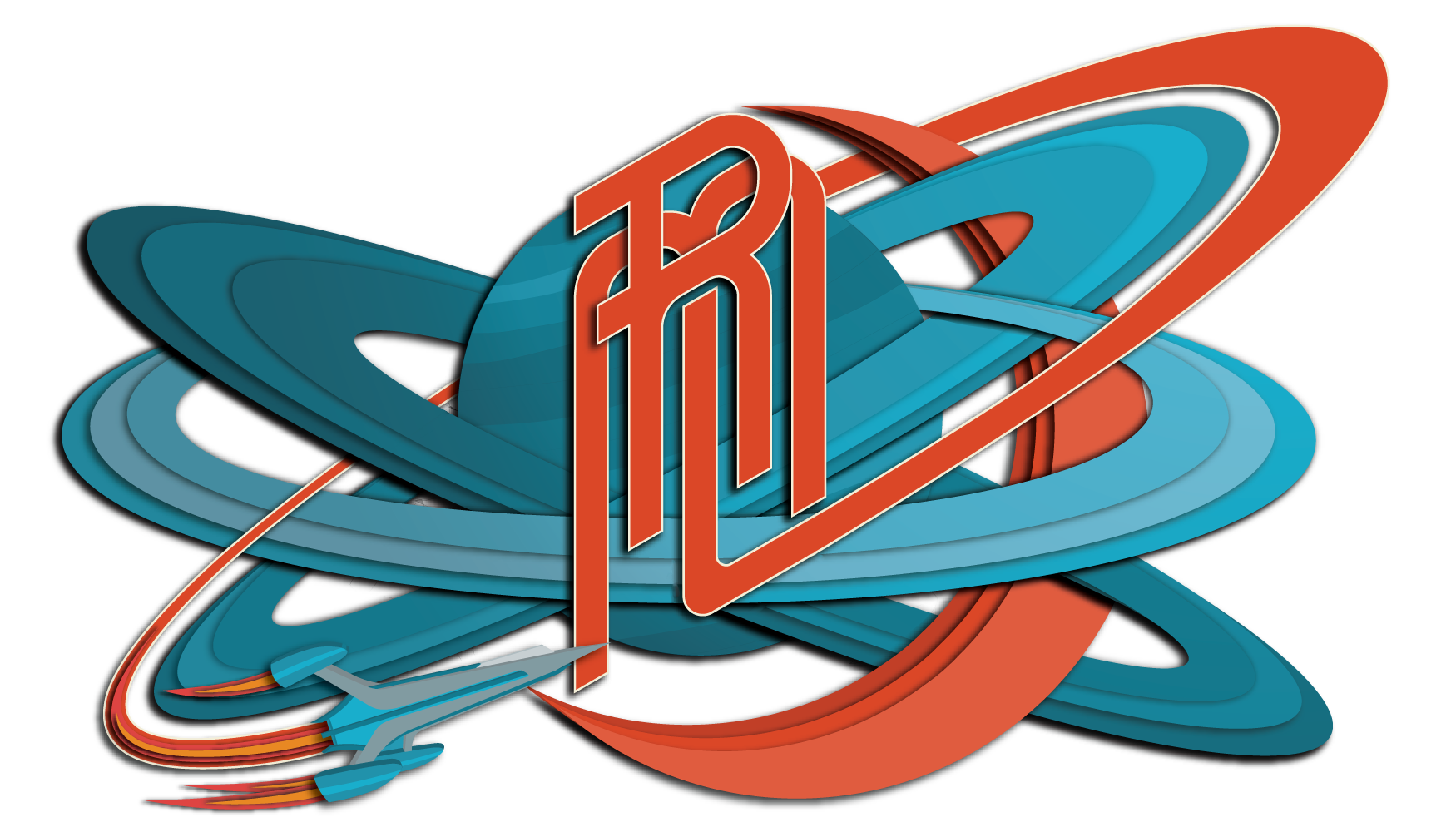
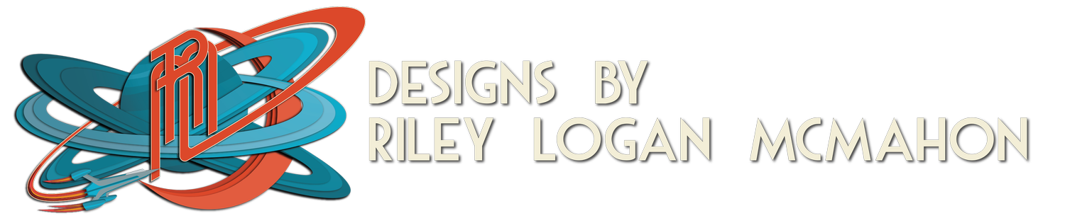
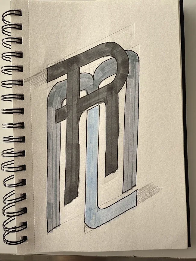
I started with the simple 3-letter setup of my initials and went from there. The first experiments were very simple compared to the final product, really emphasizing the focus on my initials without any other fun elements. The next set of logo experiments brought a lot of motion to the piece. I used a space motif and created a planet with multiple rings, which felt really fun for a logo. However, it still felt a little flat and off when it was combined with the rest of my website.

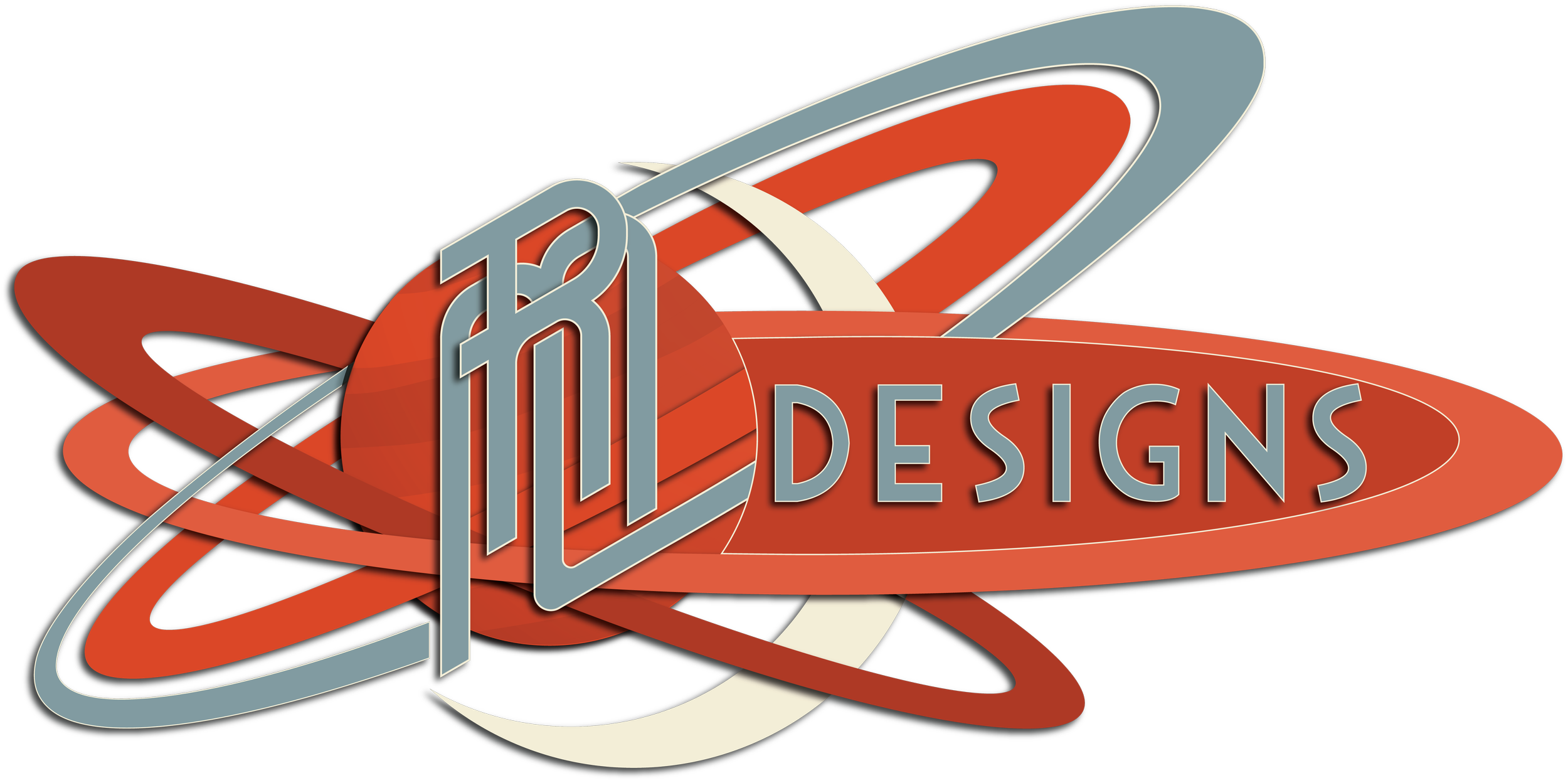
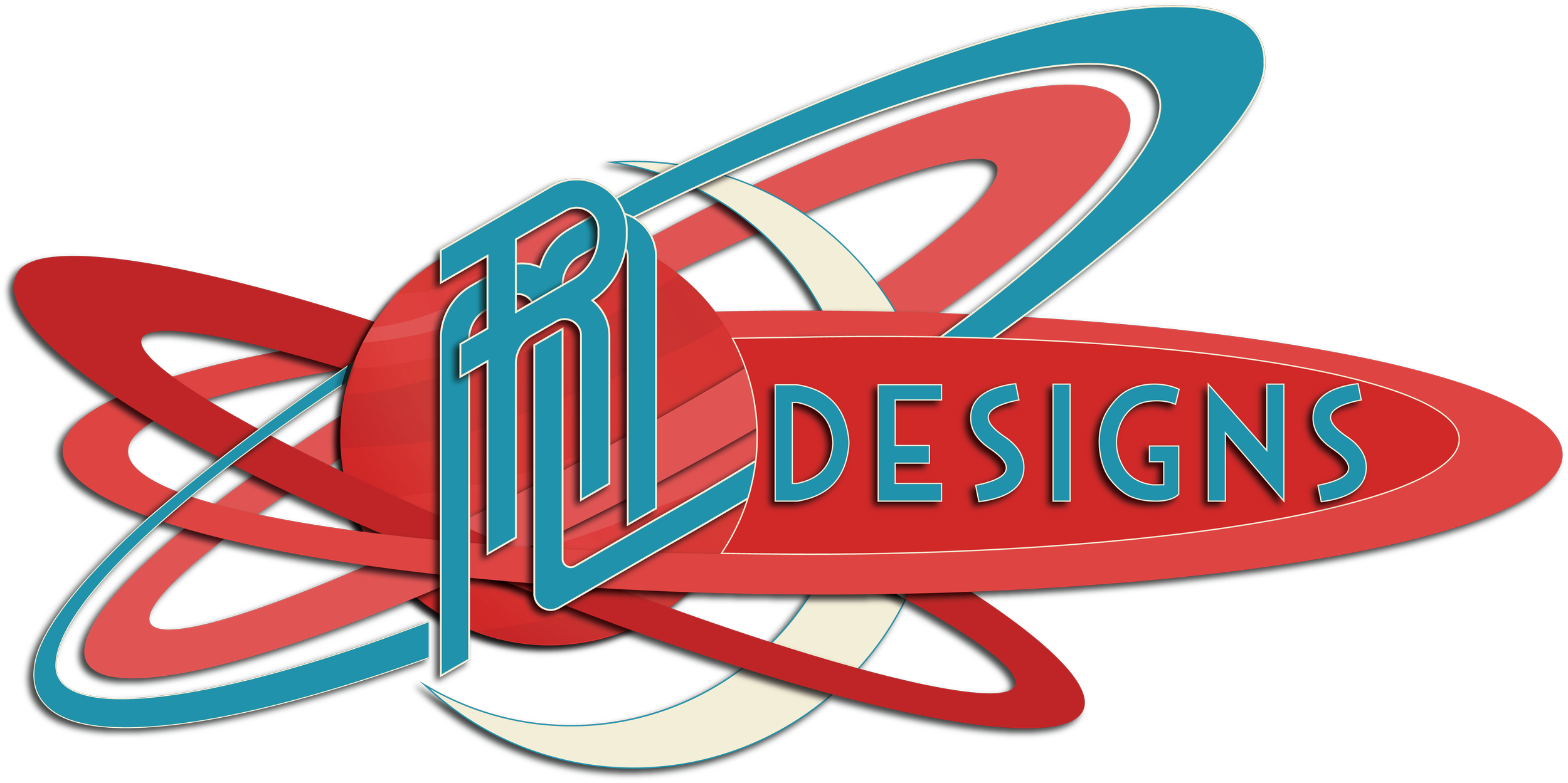
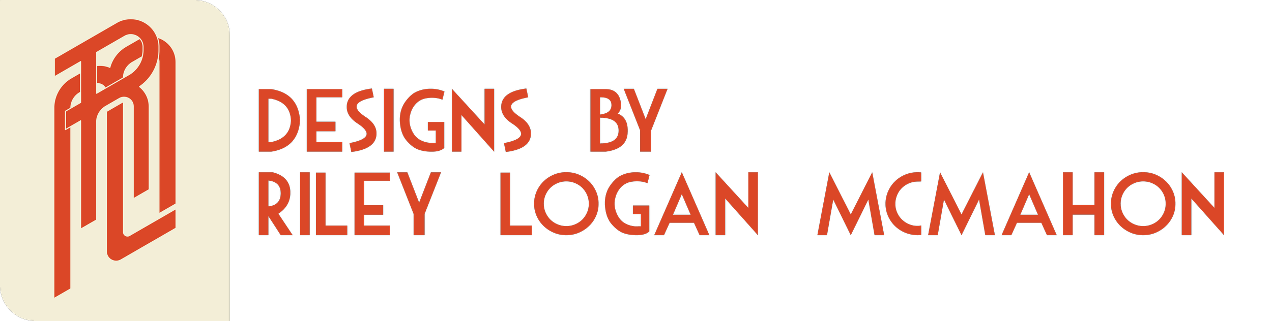
I was left wondering what I could do to match the aesthetic I had created, so I just started to play with stacking various elements in the logo, which brought a great sense of dimension to it. I removed the words, focused on just my initials, and added a rocket to give direction to the motion in the piece. Overall, the new logo works perfectly for my website, feels fun, and matches the retrofuture aesthetic perfectly!