

Spectrum Design Show Poster
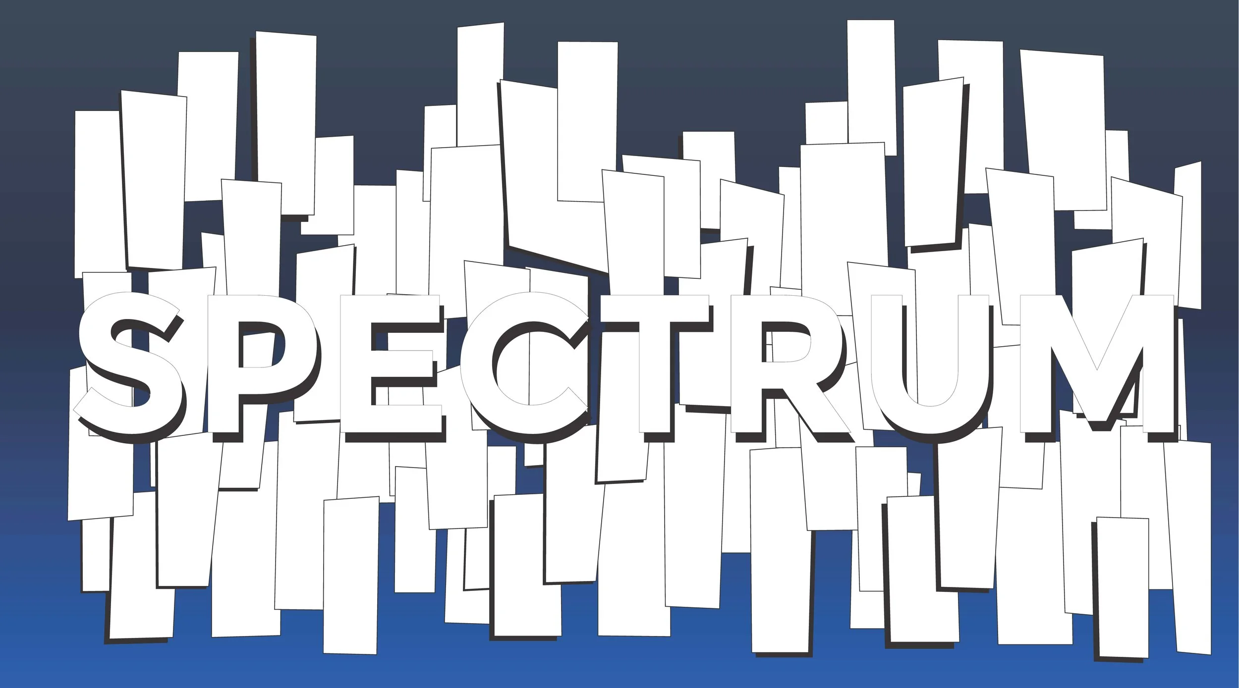
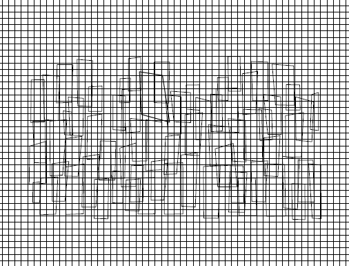
While I was in college, I got the chance to work on the poster and overall theming for a student design department show. At the beginning of the project, we knew that we wanted the show to be interactive and colorful (to go with “spectrum” as a matching theme). I experimented on the poster itself quite a lot, using grid templates, making a 3D version, and trying to incorporate a number system into the overall design.
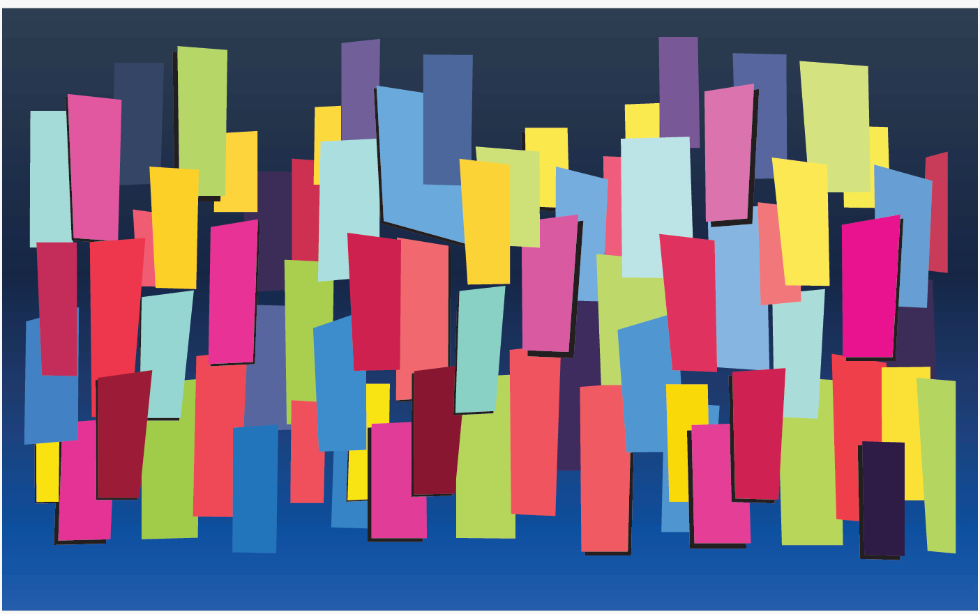
I looked at a lot of different ideas that revolved around painting by numbers (a way to help people visiting the show know where to use each color on the poster itself), but ultimately, it felt too unnatural to get people to paint something specific like that. Instead, the choice was made to leave the poster entirely blank except for the main outlined shapes and let guests of the show fill in the poster in whatever creative ways they wanted.
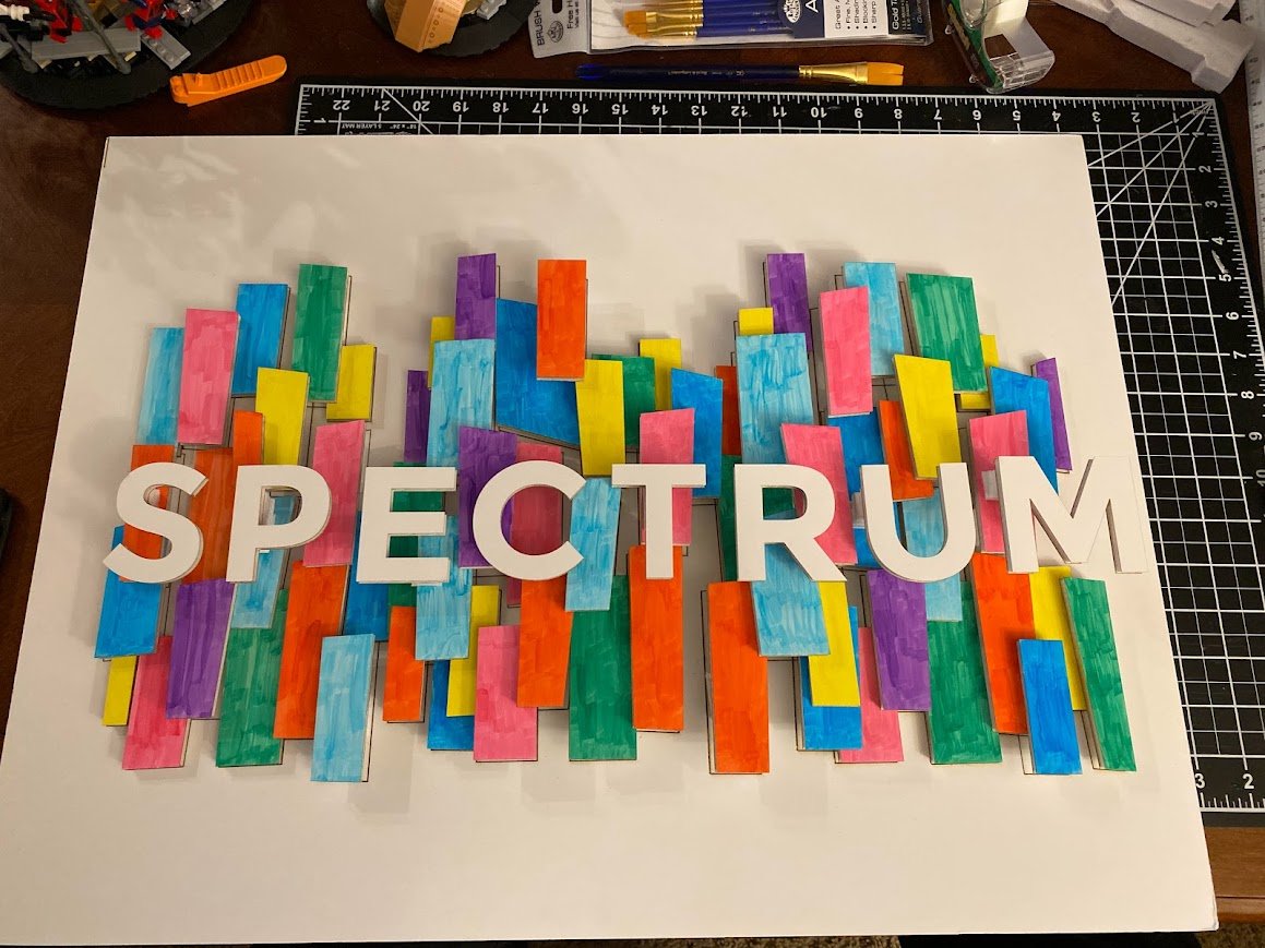
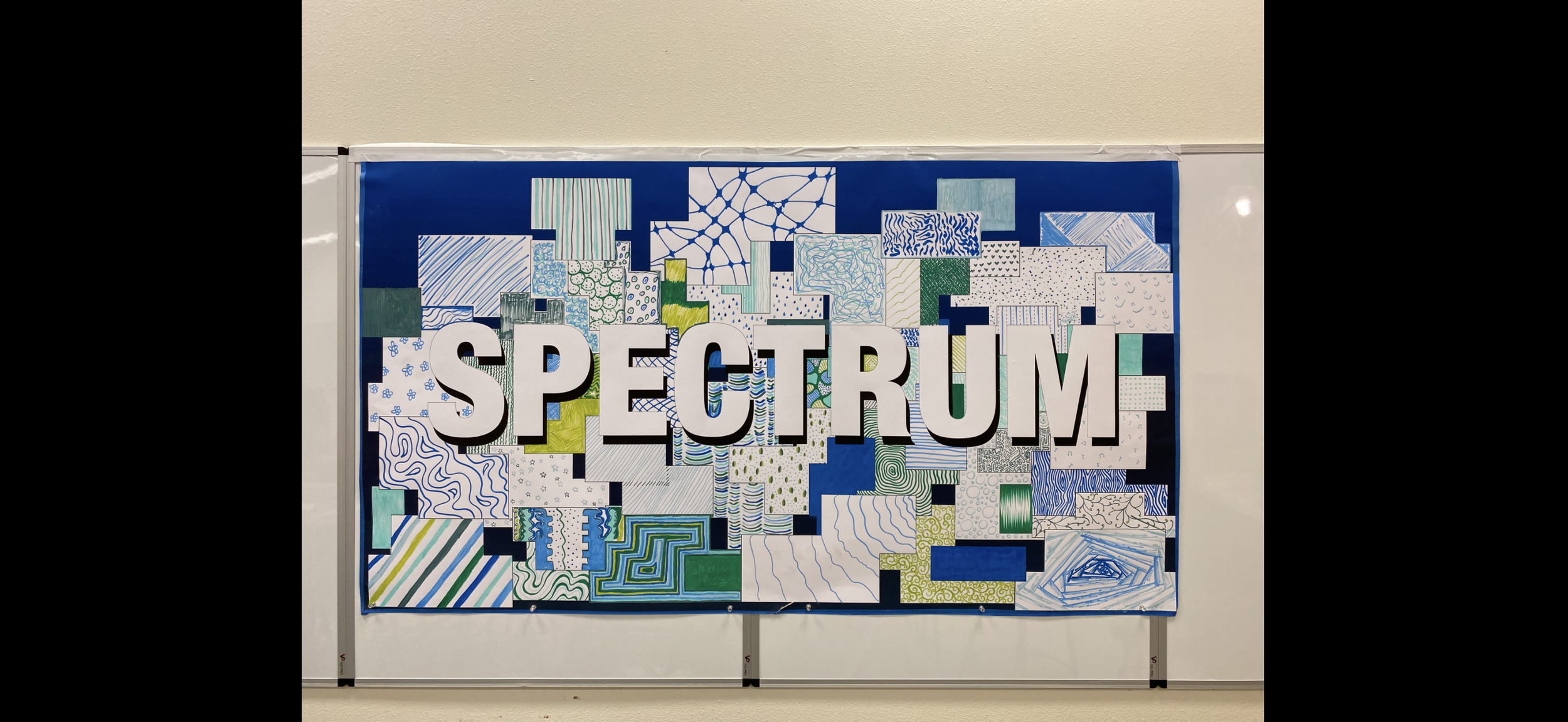
Above was my final variation of the poster that I made before passing it to the rest of my collaboration team for review. There were some changes to the theming of the show itself that necessitated the poster be altered one last time so that it matched the rest of the aesthetic.
If you would like to learn more about the final interactive version of the poster, click on the image to the left to be redirected!